Choose what the lens must recognise
A wall may need to read as painted masonry, weathered concrete or thin sheet metal. Each suggests a different combination of relief, edge behaviour and reflectance. Begin with those qualities rather than a favourite paint recipe. At miniature scale, a small bead of adhesive can resemble a major weld, and coarse sand can turn ordinary render into a field of stones.
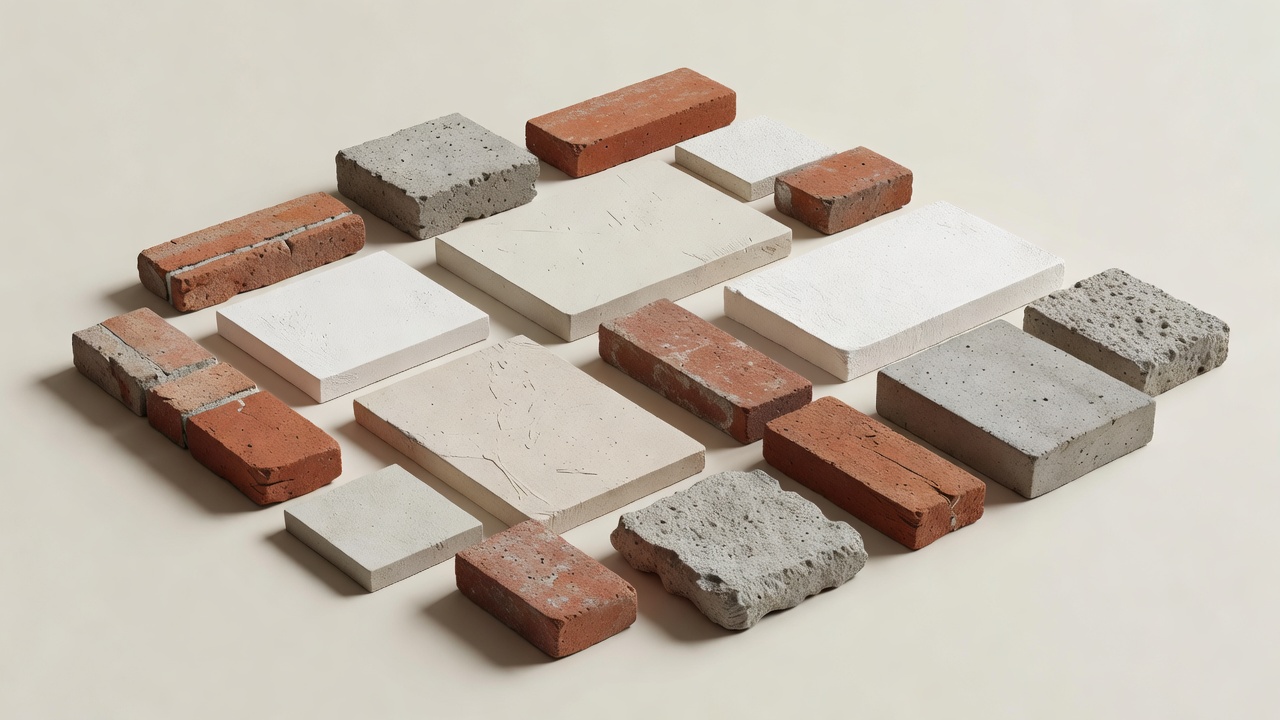
Make a sample board at the actual model scale. Include an outside corner, a recessed joint and an opening, because a flat patch alone cannot reveal how a finish behaves around edges. Photograph the sample at the intended distance under a plausible key light. Keep a plain neutral reference beside it so changes in exposure or white balance do not masquerade as improvements in the material.
Separate structure from scenic skin
The material that keeps a façade straight does not have to be the material that describes its surface. A rigid backing can carry a thin, replaceable scenic layer. Card, timber products, styrene sheet, plaster and suitable modelling compounds all have useful roles, but their behaviour differs with moisture, solvents, heat and handling. Check compatibility on scraps before committing to a large module.
Work from product safety information rather than assuming that a familiar workshop material is harmless. Cutting and sanding create dust; coatings and adhesives may require ventilation and specific protective equipment. Some solvents attack foam or plastic. Avoid hot-wire cutting unidentified materials, and do not use flame effects to test a scenic finish at the bench. Consult the Health and Safety Executive’s COSHH guidance when planning work with hazardous substances.
Give wear a direction and a cause
Begin with the base material, then add the consequences of use. Rain streaks usually have a source. Dirt gathers in protected areas. Repeated contact polishes or chips exposed edges. A repaired wall may differ in texture before it differs in colour. Collect reference photographs of real buildings and annotate the causes you can see rather than copying every visible mark.
Build the finish in controlled stages. Establish broad value variation first, then local staining, then a small number of sharp accents. Photograph each stage. If the wall becomes visually busy, stop and compare it with the wider frame. A foreground ruin may justify strong relief; the same treatment on a distant building can compete with the story’s intended focal point.
Keep scale in the weathering marks themselves. A brush streak that looks delicate in the hand may become an implausibly wide leak when translated to full size. Wipe and soften marks while they remain workable, and reserve the strongest contrast for features that need to survive the final lens and grade.
Make gloss a design decision
Real materials rarely share one uniform sheen. Glazing, painted timber, damp stone and dusty pavement reflect light differently. Those differences often explain the environment more effectively than extra sculpted detail. Test clear coats with the lighting department: a finish that appears restrained under broad workshop illumination can produce a distracting highlight under a small source.
Roads deserve particular care. A glossy surface may suggest rain, but it can also expose scenic seams and reflect equipment outside the intended world. Decide whether reflections are desirable and what they should contain. Keep alternative matte and semi-gloss samples available rather than relying on a last-minute spray over the finished set.
Study a visual language, not a secret recipe
Blade Runner is a useful reference for dense urban imagery and layered light, with miniature work associated with Entertainment Effects Group and practitioners including Mark Stetson. Alien, whose effects work included Brian Johnson, offers another way to examine the relationship between industrial surfaces and dramatic lighting. The lesson is not that every science-fiction model needs grime. It is that finish and illumination must describe the same world.
For a deliberately different register, look at the miniature environments in The Grand Budapest Hotel, with production design by Adam Stockhausen and miniature work associated with Simon Weisse. Stylisation can be coherent without imitating everyday realism. Lorne Peterson’s Sculpting a Galaxy is also a useful published reference for understanding how miniature forms and surface decisions contribute to screen images.
Keep the recipe repeatable
Label approved samples with the substrate, preparation, products, mixing notes and order of application. Record drying conditions where they matter, and retain enough matching material for repairs. A photographed reference is helpful, but a physical sample is better for judging sheen and relief. The final question remains simple: does this surface support the shot when it is seen at its intended size?